Microsoft Docs has thousands of articles created to provide guidance on hundreds of topics. Having a way to easily move through related material decreases the amount of time users take to find additional relevant information. We sought to optimize this experience, as well as, increasing traffic to other areas in Learn.
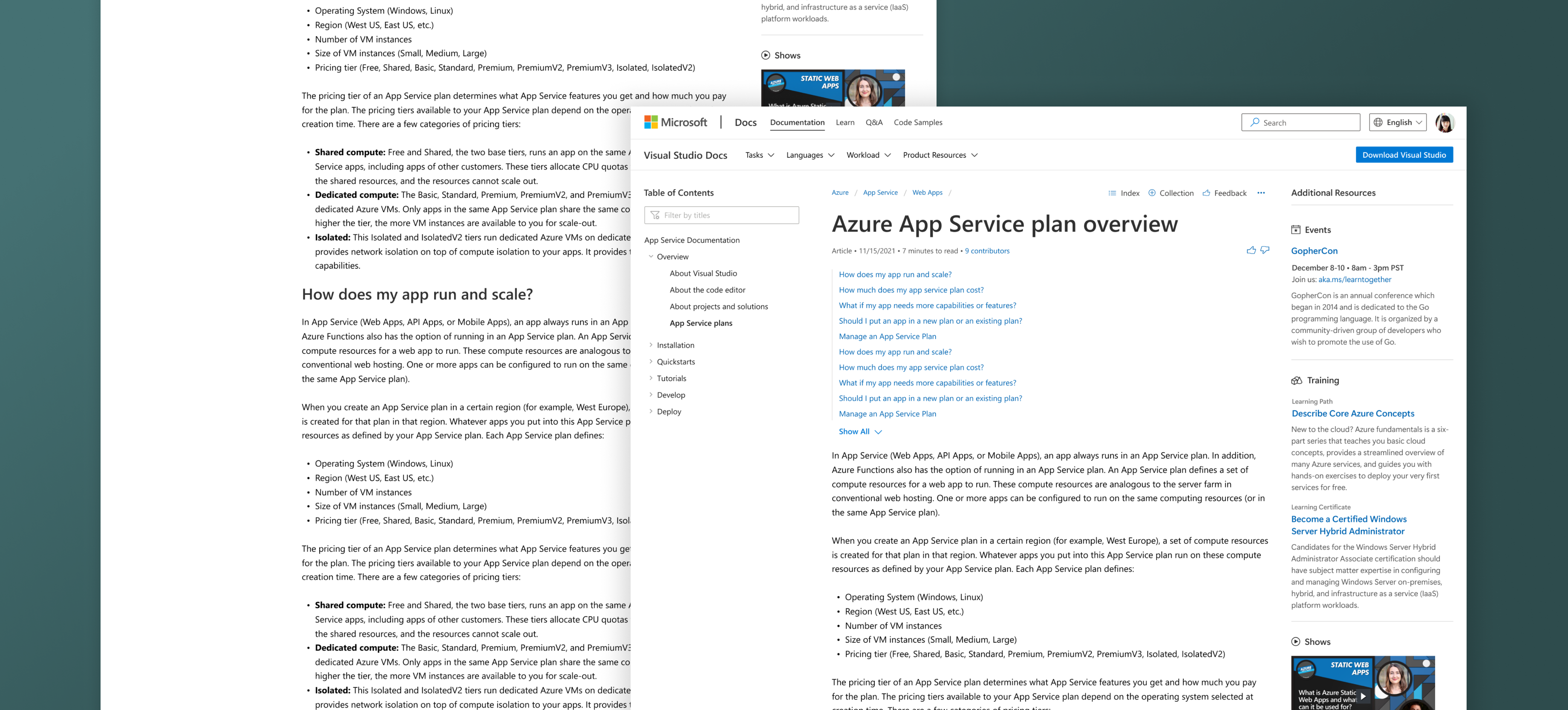
The Docs site has a three column layout, with the main content taking up the widest one in the center. The left column houses the Table of Contents, which can be complex depending on the topic. The right column only contained the "In this article" index, which helps the user navigate through the article.
By moving the index to the main column, it created space to bring in the "connected" resources from all areas of Microsoft Learn. I created the right column to include: related articles, training modules, events, Q&A, and several other training resources.
Background
Product Design
2022